“Back to school”, told by an architect who wants to be a UX designer.
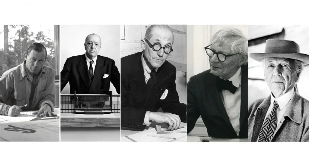
My name is Jesús Reyes and I only have one thing in common with some of the people in the photo (…and I say only some because not all of them held it): the architecture degree. All my professional practice, although it has already been in “color” (I was born in 1982), is based on design methodologies related to the modern movement that, as the previous photo of the fathers of architecture reveals, are already somewhat obsolete, in “black and white”.
That is how they teach you to “design” in Architecture School: with tools (and not so much with methodologies) that are somewhat subjective, without much scientific rigor other than conceptual inspiration and studying the great geniuses of the past century a lot, so you know how to detect good or bad architecture.
Nor can we forget that famous cliché that I have had to carry unfairly. Yes, I am talking about the so-called “architect’s ego and their airs of superiority”, which really circulated through the profession before the housing crisis broke out, of course, when the profession was not (yet) so discredited.
I’m talking about that egomaniac, sometimes wearing a top hat while teaching me and smoking when that was still somewhat “legal”, who, when he didn’t have a reasoned answer to questions about design decisions, would blurt out:
“Because I say so, and besides, I know more than you! I have a lot of built work and you are still starting to study… You will understand!”
On the other hand, I will always remember a great friend and now colleague (and “bar closer” in the pre-covid era) who, starting the Architecture degree with me, asked another student who was already finishing:
“Hey, a question… and what exactly is this designing thing?”
(Laughter and mockery were heard from the seniors…)
“I don’t know, rookie… and if I knew… I wouldn’t tell you!” he answered.
Nothing could be further from the truth.
It is true that it is a secret that everyone has to discover on their own, not only during their university degree, but also throughout their professional career. And that must be precisely why there are so few great architects today who are doing things fairly well.
No one teaches you any methodology to succeed in this world!
The hardest thing is not writing an architecture project, but the whole hard journey from a blank piece of paper to its definition. It is the personal methodologies that you implement during the design process that make that path a little more bearable. They lead you to a more or less successful goal and, I insist, they are only learned with experience.
Let’s say, to understand each other, that “every master has his own trick”.
There is no manual as such, adapted to our times, with clear methodologies for designing. Or at least, I haven’t found one yet. Obviously, the ancient Treatises of Vitruvius (written in 15 BC, and it’s no joke) or The Four Books of Architecture by Palladio (1570 AD) do not serve me in the century we are in, and even less in view of the brutal social and technological transformation that we are experiencing in our cities.
However, I don’t want to forget great contemporary architects like OMA-Rem Koolhaas with his book S, M, L, XL (opens in a new tab) or BIG-Bjarke Ingels with his Yes is More (opens in a new tab), where each one explains their own personal way of understanding architecture, and which I recommend reading. But that doesn’t work for me either as a “universal methodology” to start or develop projects.
I don’t want to bore you with this topic, but you will understand later why I insist!
To summarize:
I have also been forced to use a work methodology of my own, without any script previously established by someone else, or in other words…
“If you want something done right, you have to do it yourself.”
In painting and literature, we often talk about the inspiration of the muses, the divinities that inspire the arts. According to Greek mythology, they came down to earth to whisper ideas and inspire the mortals who invoked them.
In architecture, we could also say that there is something very similar to the inspiration of the muses, but I personally prefer to call it a “catalog of references and trends”, which unconsciously tips the balance towards one formal concept and not another.

Frank Gehry: “98% of what gets built today is pure shit.”
It is clear that whoever studies the work of the great geniuses of architecture the most, and follows new trends, will have more “tools and resources” to complete a good design process. In fact, knowing how to copy well is not easy at all… and I’ll leave it at that.
Jesús Reyes: “I am nobody in this world, but… I also think like Frank.”
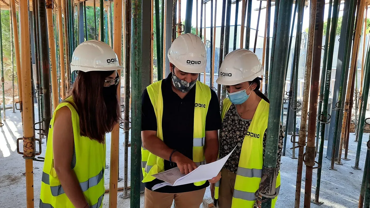
The work methodology in an architecture project, before it goes to construction, would be a waterfall, sequential one, going from one number to the next as each phase is completed:
- Definition of scope, needs or objectives.
- Architectural program.
- Conceptual sketches, working models and design hypotheses.
- Preliminary design.
- Basic project.
- Execution project.
But… is there any way to speed up these design processes in each of these phases? Yes, the mythological way… Let the muse come down to Earth and tell me!
And now that you know where I come from and where I am supposed to go, you will be able to put yourself in my shoes (empathize: a keyword in the UX universe) and understand how I experienced my first Design Sprint, in the first week of a UX design bootcamp (opens in a new tab).
Neoland: the Design Sprint methodology
“How to solve problems and test ideas in just 5 days.”
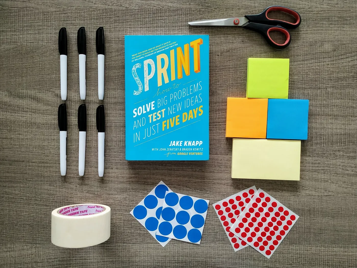
Now in my shoes, you will understand that, faced with a headline like this one about 5 days, an architect with my background felt a big wave of skepticism on the first day of class. But finally they were going to teach me a methodology to reach a specific goal. And in record time!
This is exactly what the Design Sprint is about. It was invented by the “moderns” at Google Ventures, the investment arm of Alphabet. It is a work methodology where, through different stages, you try to answer a problem or a need with a range of creative ideas and an express prototype that is tested in the last phase.
With this practice, which is also incredibly fun, you can fast-forward into the future to see your almost finished product and the users’ reactions, which give you very valuable feedback before making expensive commitments.
The proposed topic
How can we contribute with technology to foster empathy for animals?
And suddenly, continuing with the architecture simile, I found myself starting to build the house from the roof down.
All this was totally different from what I was used to, but I said to myself…
Why not? They are going to teach you design methodologies, something no one has ever taught you before… Take advantage and bring out everything you have inside! Here we go!
I remembered that I had sometimes seen houses that had been started from the “roof”.
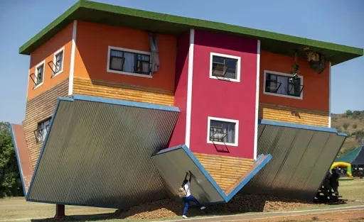
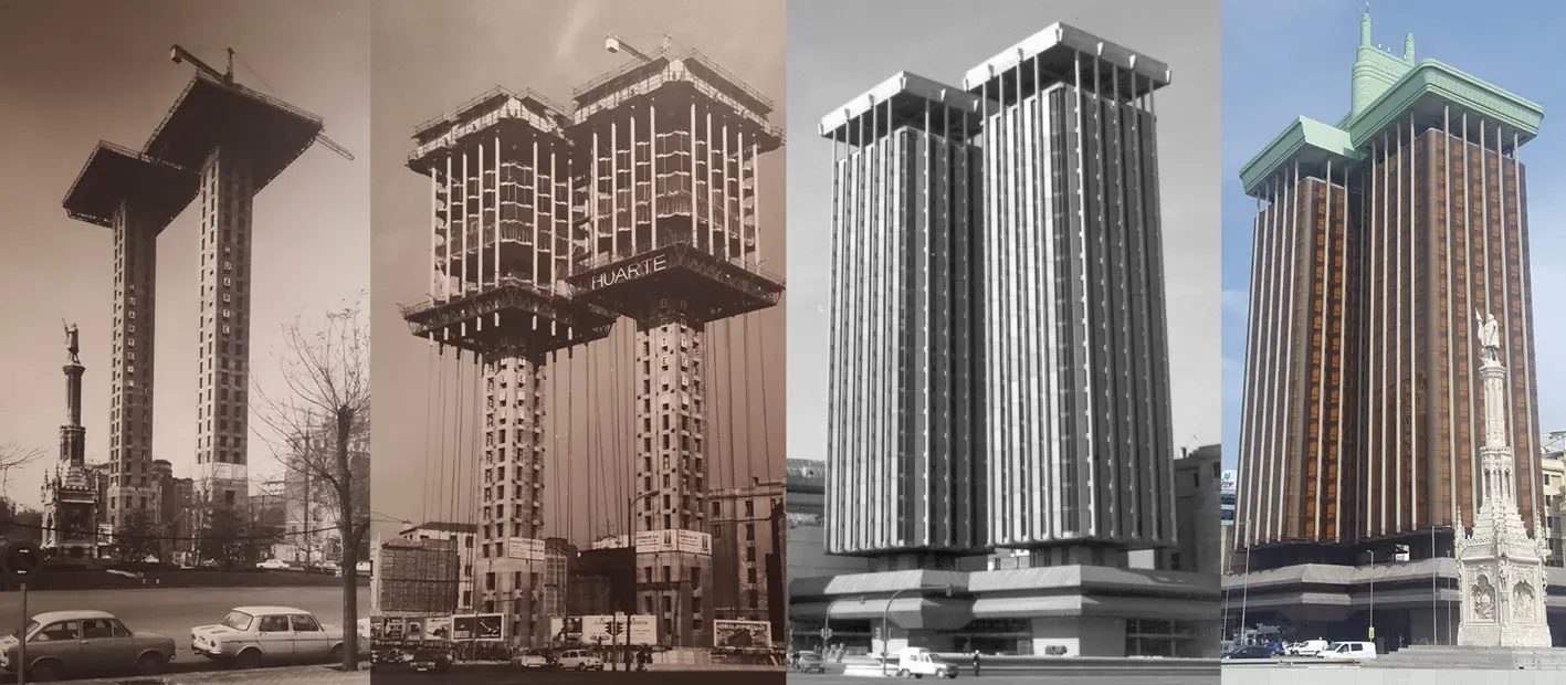
And a reference from Madrid, where I live, even came to mind. It is currently (year 2021 AD) trending because of its renovation and the controversy around it: the Torres de Colón.
They are built with a suspended structure: the building is made of two large pillars joined at the top by a platform from which, hanging from large perimeter beams six meters deep, a total of 18 pendulums with steel cables hold each floor. Both towers were built from top to bottom, making the saying “starting to build the house from the roof down” come true.
Back to the topic at hand. I don’t want to go into each phase of a Design Sprint in depth, because it is an agile methodology that is best practiced in real life to fully appreciate its potential. I recommend reading the official book, Sprint (opens in a new tab), by its inventor, Jake Knapp, who explains it perfectly.
But if you don’t have time, don’t worry: I can summarize it simply in this image, so you can see how clearly the 5 days are planned in the calendar, with well-defined phases and goals. This calendar can be reduced by one or two days depending on each company’s needs, but in our case we did the original.
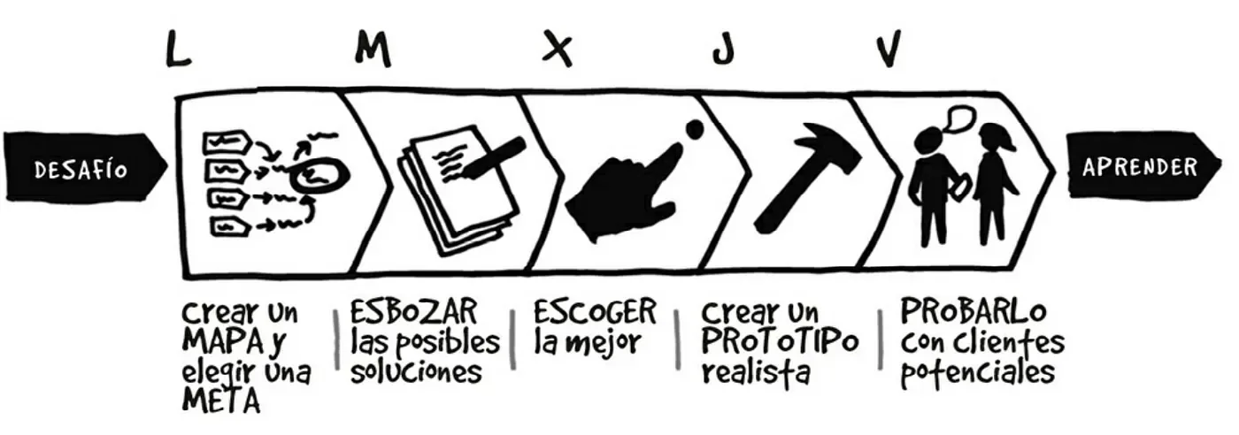
Teamwork is one of its strongest points. The continuous reflections we made, both individually and as a group, together with the strict timing of each phase, make you move forward in a very dynamic, agile way, reaching goals almost without realizing it.
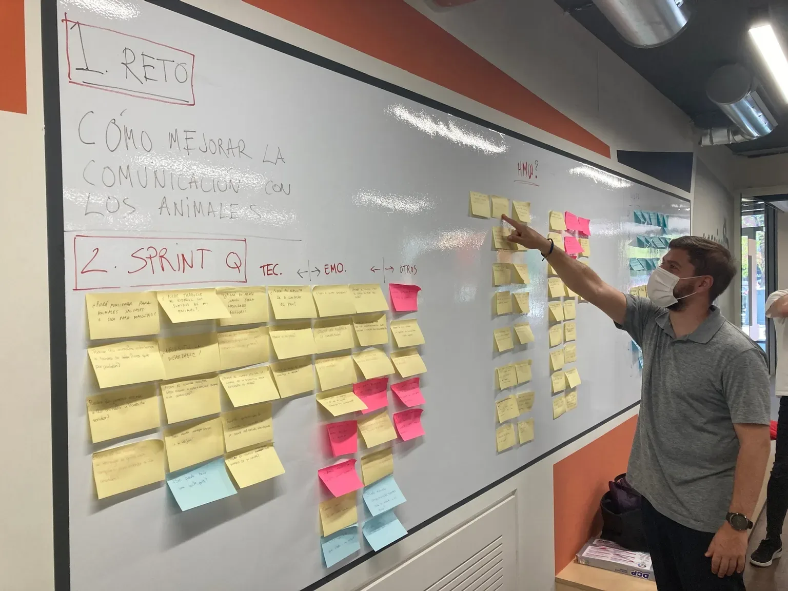
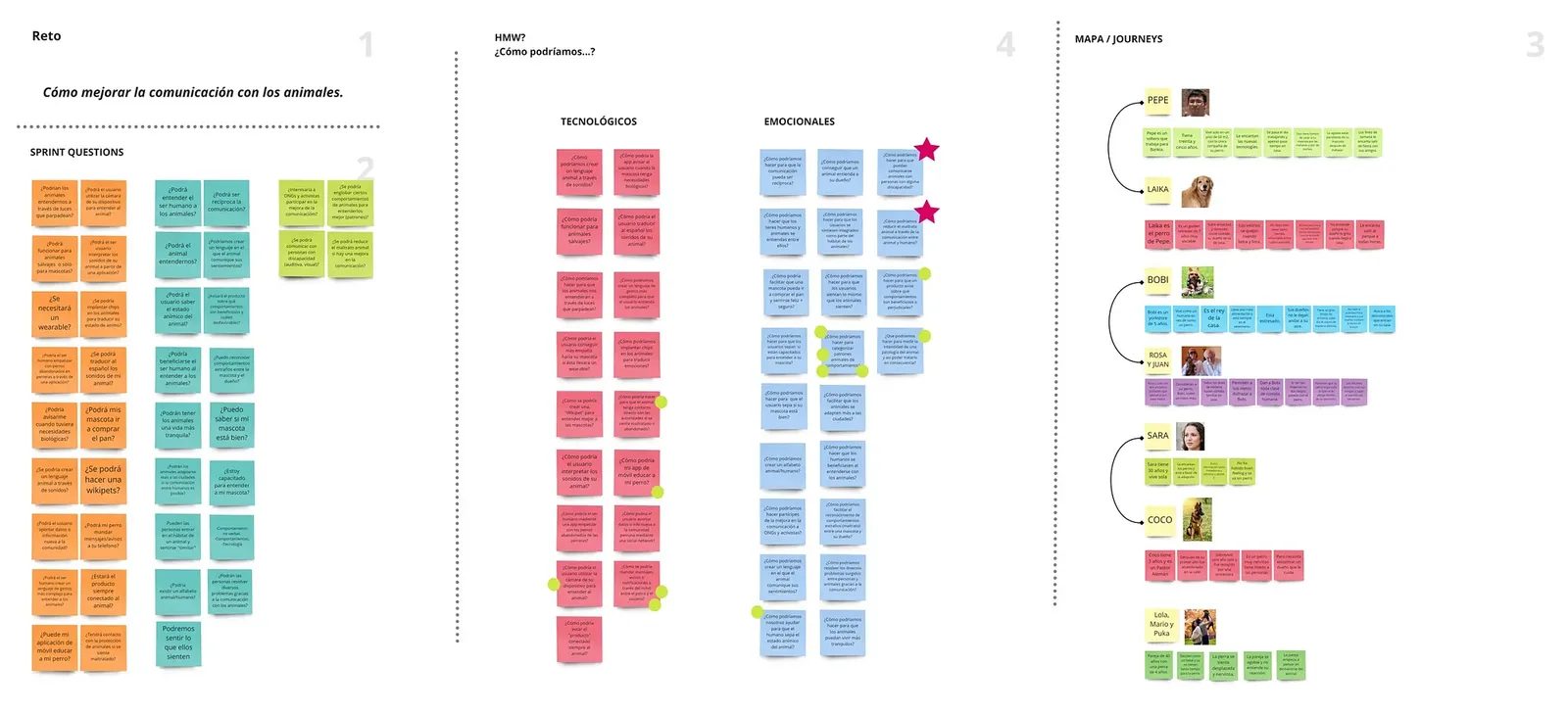
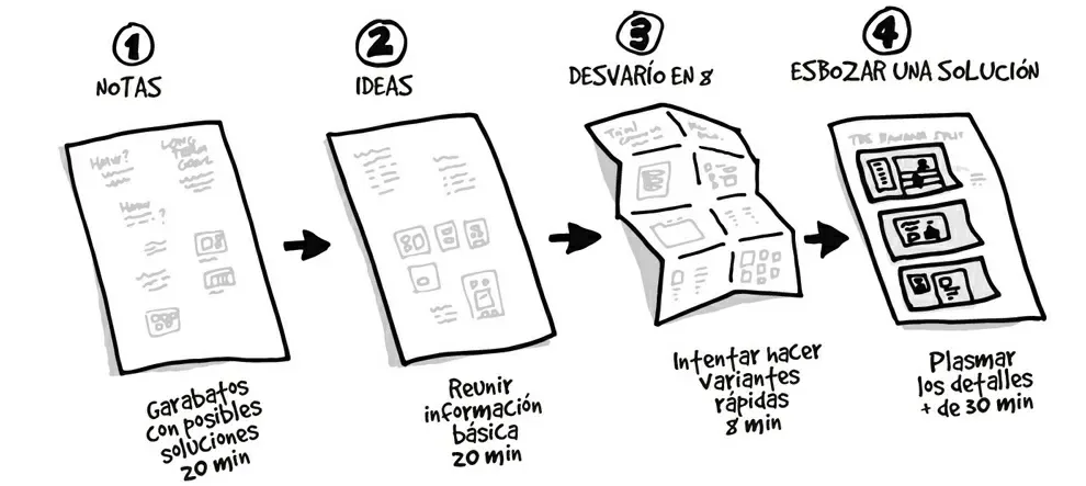
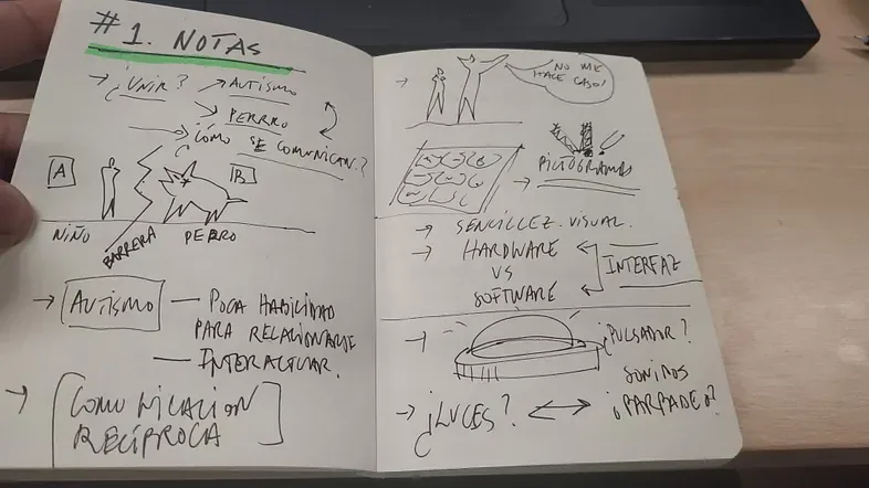
A picture is worth a thousand words, so below are different activities from each phase, to give you an idea of how we worked each day!
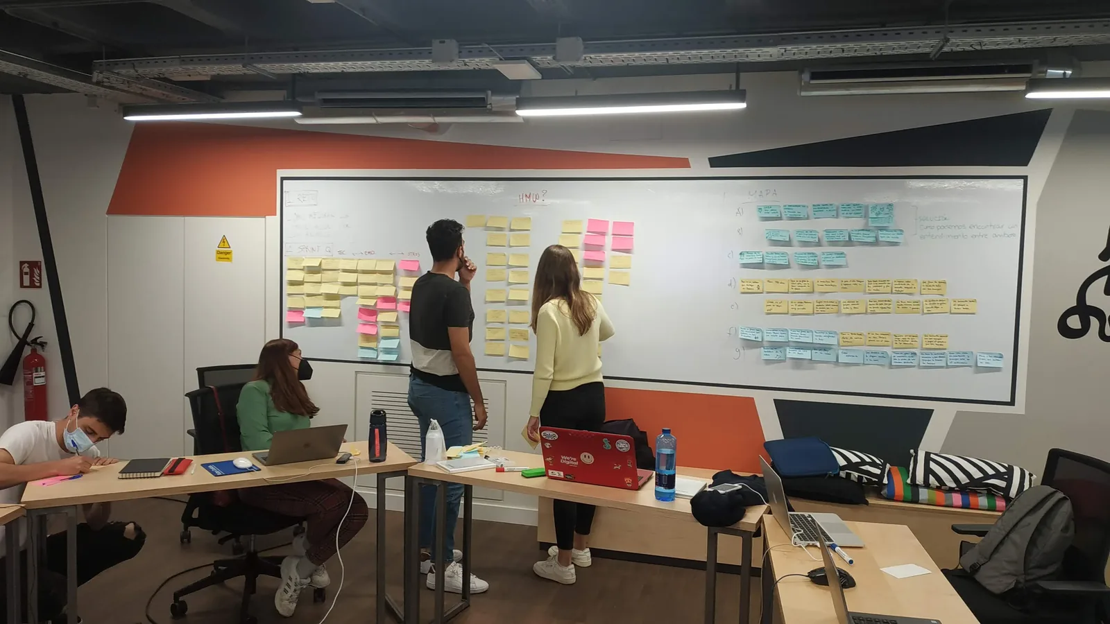
Day 1. Map the problem and choose a target
Day 2. Sketch possible solutions

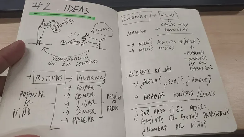
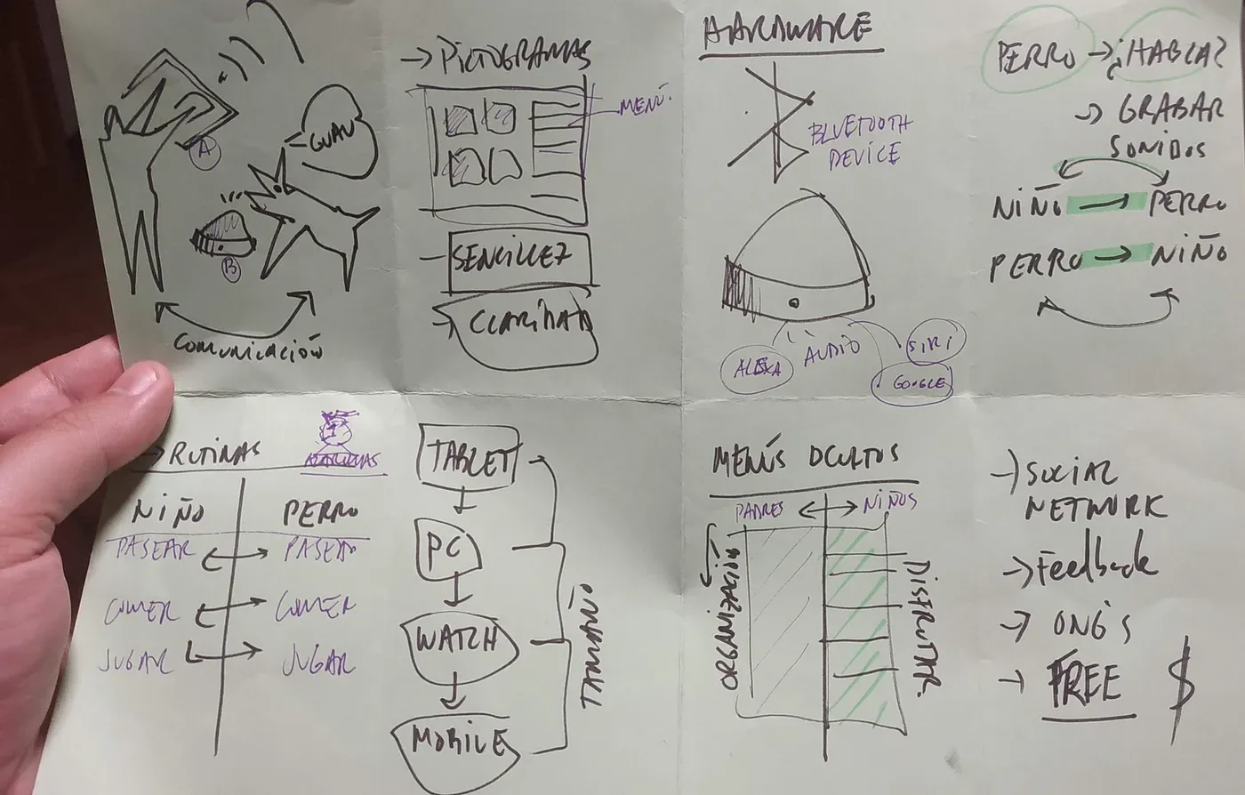
Day 3. Decide on the best solution: art museum and silent voting

The most voted option!
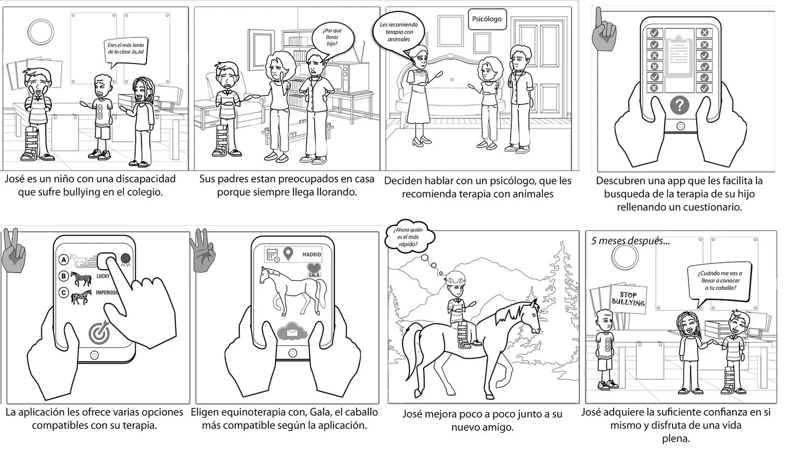
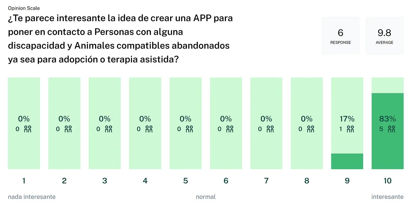
The Pet Help prototype got the most votes. Its core idea was a mobile app that tried to solve the following need:
Connecting people with disabilities and animals through a questionnaire that looks for compatibility between animal and user.
The app would work both to book appointments at centers specialized in animal-assisted therapy and to make it easier to adopt animals, based on compatibility and type of disability.
We created a very particular storyboard that helped us clarify and reinforce the target, so we wouldn’t lose our way in the next phase.
First, by sketching very quickly:

Then, with digital tools:
Day 4. Create a realistic prototype: Abante
And the fourth day arrived. It was time to move to an individual phase and create a prototype based on the winning idea.
In my case, I named the app Abante, the name of a well-known centaur in Greek mythology.
This mythological creature —half man, half animal— perfectly reflects the idea of symbiosis between animal and human that the project is built on, like a solid foundation¹.
¹ Occupational hazard.
And I built my first prototype in Figma. Suddenly a new world full of possibilities opened up for me!

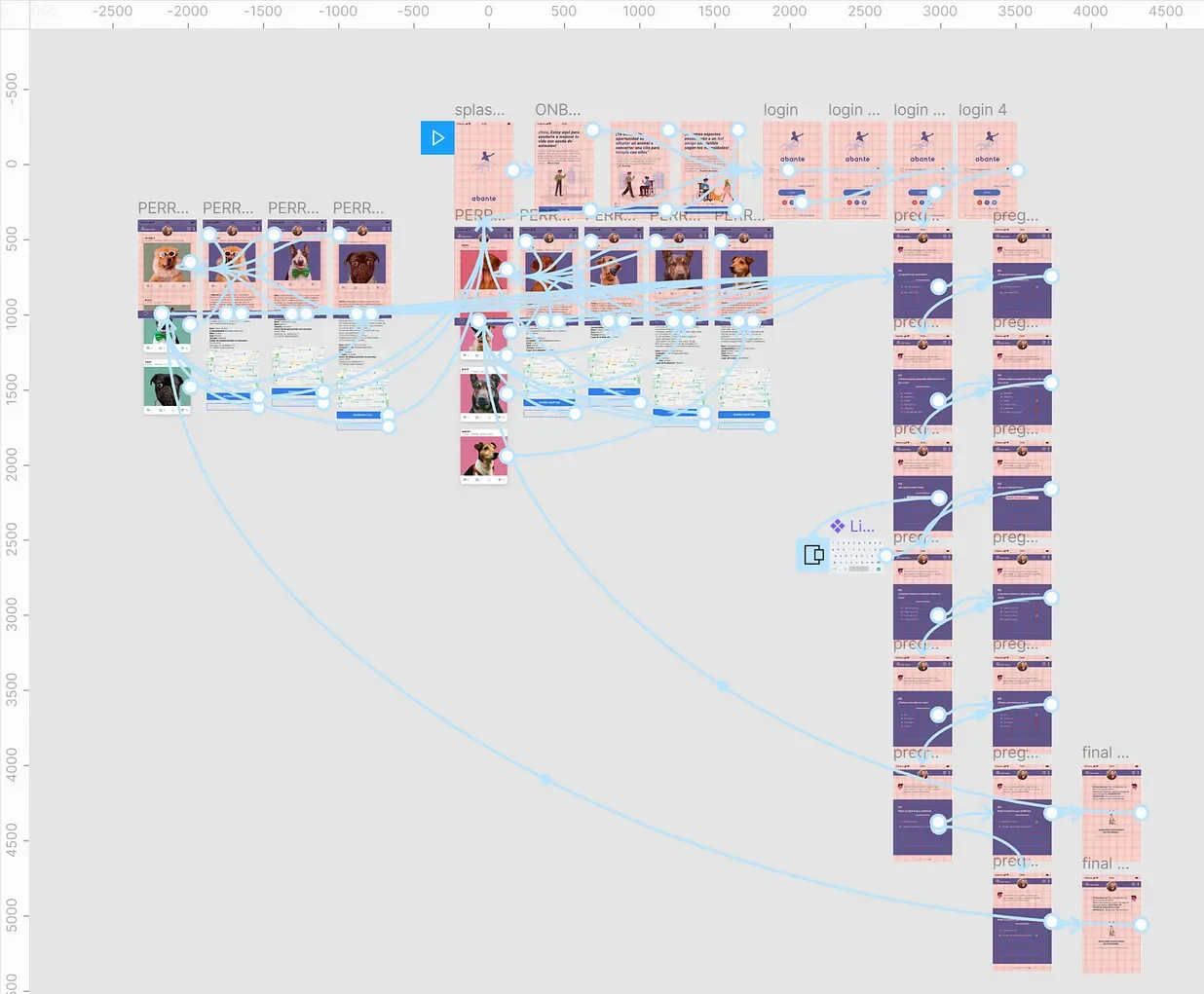
To summarize, the app had the following screens:
- Splash screen with logo and app name.
- Three onboarding screens with motivational quotes from famous people and an explanation of the needs the app covers.
- Login screen (social or via email).
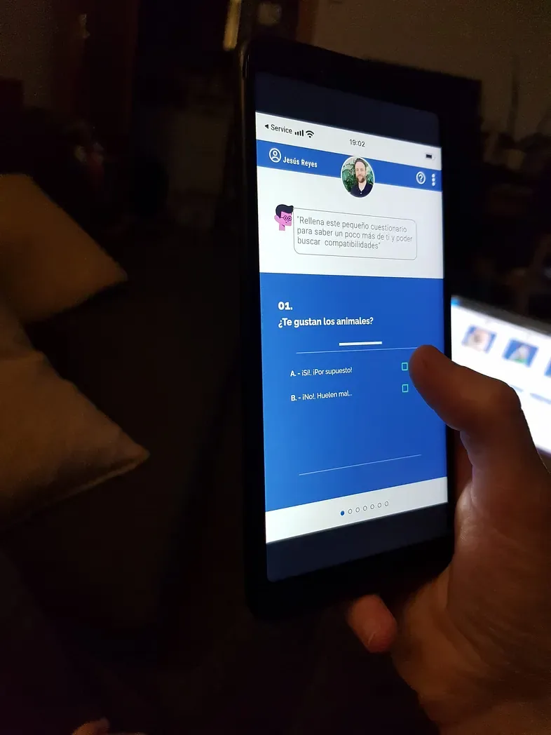
- Questionnaire with checkbox questions.
And, depending on the last question of the form:
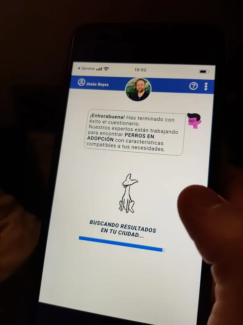
- A feed with cards of dogs for adoption, based on the compatibility results from the questionnaire.
- A feed with cards of dogs available for appointments at animal-assisted therapy centers, based on the compatibility results from the questionnaire.
Below you can watch a video of the interactive prototype, to better understand what I just summarized.
Day 5. Test it with potential customers
The day came to test with real people. I used Maze, a tool that makes it easy to ask questions and create specific missions to get feedback from real users on challenges defined in advance.
The test was done with 6 different people (4 women and 2 men):
- María, 34.
- Debbie, 39.
- Sergio, 38.
- José Ignacio, 33.
- Cristina, 40.
- Laura, 33.
Below are also some photos of the screens from one of the users, who agreed to use the app on his phone for the test while I carefully watched all his movements and asked him questions about navigation and many other aspects.
From skepticism I went to personal pride (≠ ego) in 5 days.

A. Questions for users
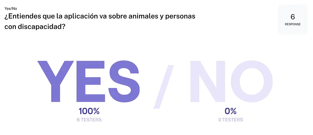

B. Missions and heatmaps

C. Conclusions
What worked:
- First impressions are generally positive. From the start, people understand which needs the app tries to cover.
- The app seems easy to use and doesn’t confuse users, thanks to its consistency and standard UI patterns.
- The missions to book an appointment with a specific dog at a therapy center are completed successfully, and so are the adoption ones. The card feed works perfectly in both cases.
- People really like the spinners, because they reassure the user that everything is going as it should.
- The form turns out to be very intuitive.
What didn’t work:
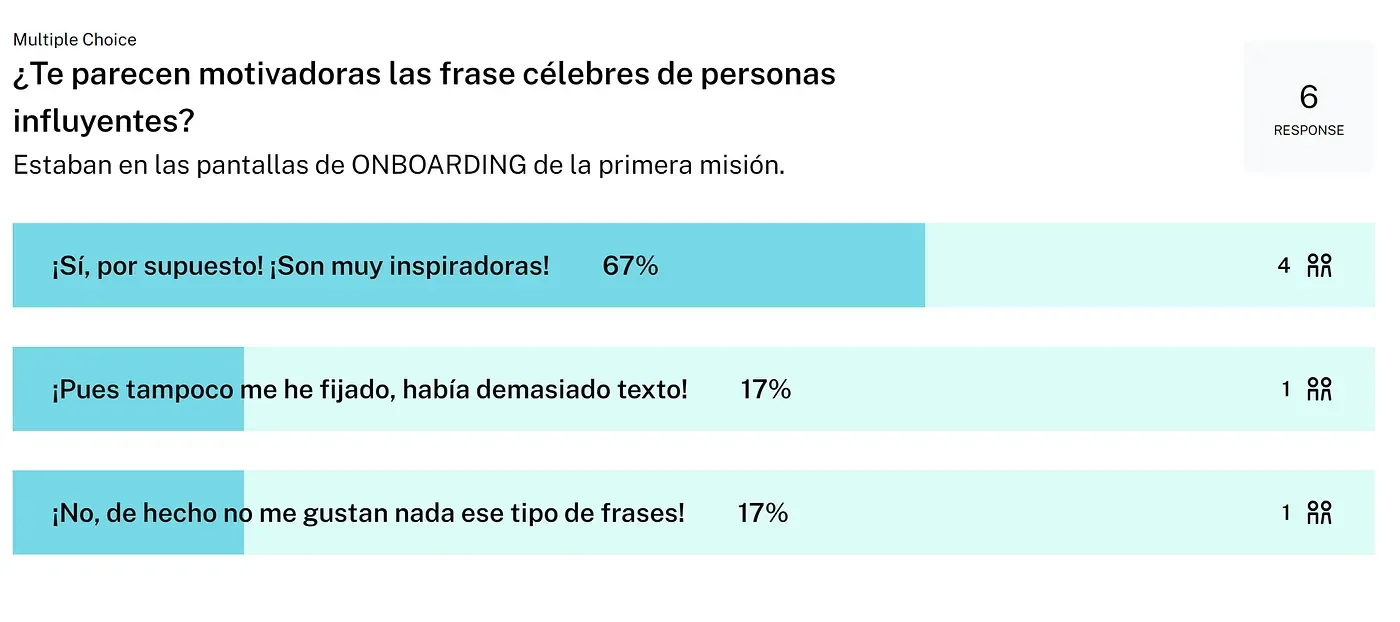
- 100% of users skip the onboarding: when they see the “Start” button on the first screen, they don’t scroll horizontally to see the next two introductory screens.
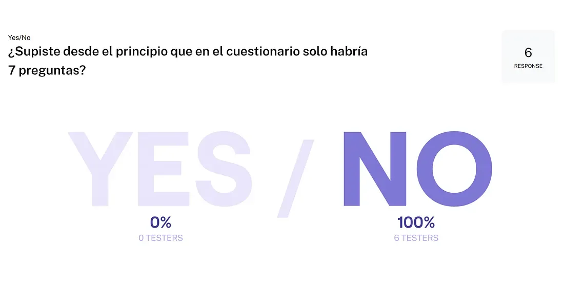
- 100% of users don’t know how long the form is, even though there was a progress bar.
And the most important thing: I have learned to use a methodology! Finally!
D. Next steps
- Improve the onboarding to make it more interesting, and review the buttons.
- A questionnaire that is too long can drain people’s patience, and users must clearly understand their progress.
- The logo is too harsh. At first glance, it looks like a business app.
- The visual layer, and especially the typography, must be reviewed.
- Think again about the famous quotes, in case they feel too clichéd.
- Study adding more animal species for therapy, or keep it only for dogs.
- Go deeper into the project with psychologists specialized in animal therapy and with animal shelters, to better understand the problem.
- Iteration is needed! Always…
…and what better than this example by the great Escher to close my first Design Sprint, again finding a simile in architecture.
This infinite staircase, now seen through the eyes of a UX designer, symbolizes the iterative design review process that starts today and will never end… and that will be a very good sign! Right?
