A new concept of remote work, but as a team; powered by Booking.
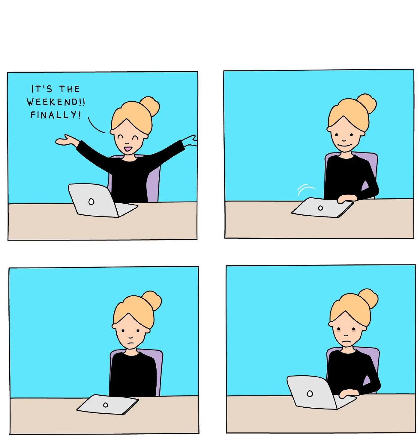
Since March 2020, with the pandemic lockdown, many workers have replaced the office with their home. Mid-morning chats with a donut in one hand and a coffee in the other have been swapped for informal video calls (…and that’s if someone organizes them…).
It makes sense, then, that many employees changed overnight, almost without realizing it, how connected they feel to their colleagues during the remote workday.
Furthermore, as recent research (opens in a new tab) shows, employees hired during the pandemic seem to be less engaged and less proud to work at their company than colleagues who joined before the pandemic. This lack of motivation and connection with colleagues is starting to create worrying scenarios for CEOs, who are finding it harder to retain their new employees.
So, here is our challenge.
Challenge
To build an MVP, in less than 2 weeks and using a Lean UX methodology, that offers a solution to help include all the employees of a company, both on-site and remote, and avoids gaps and disconnection.
Lean UX
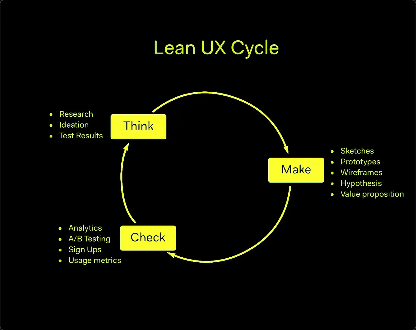
Jeff Gothelf defines the Lean UX methodology as:
“The practice of bringing the true nature of our work to light faster, with less emphasis on deliverables and greater focus on the actual experience being designed.”
Kicking off the ideation phase!
After intense research with techniques like netnography, we found there was a heated debate on social media about remote work being imposed overnight.
With this trend identified, we kept researching. We started with benchmarking and individual desk research, which gave us even more clarity, enough to start the ideation phase on the right foot.
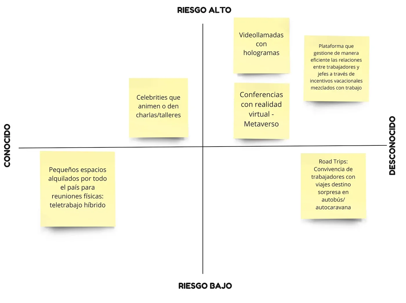
We decided to build a prioritization matrix with several of the ideas the team came up with. Our goal was to go for the most disruptive idea; that is, the most unknown and risky one in the market.
This is exactly what Lean UX is about: betting on new ideas and launching them quickly to the market. The goal is to see how they evolve, so you can easily pivot before having a finished product. Hence its famous motto: “fail fast and cheap”.
So, it was time to take a risk!
Idea
The winning idea was to create a platform, sponsored by Booking, that connects hosts of accommodations and resorts left empty by the pandemic with companies that need to rebuild their employees’ sense of belonging and connection.
- Users: hosts, business owners and employees.
- Client: Booking.
The goal of the project is to reverse the “loneliness” that employees feel now that they work in isolation from home. How? By giving their companies the option to create “collective remote work” groups away from home, in dream locations, for limited periods of time.
With this idea clear, it was time to go one step further and declare assumptions around the project. These assumptions help us find which user needs our MVP can cover.
Once again, we used a prioritization matrix to highlight the most risky and unknown assumptions. This time, to turn them into hypotheses.
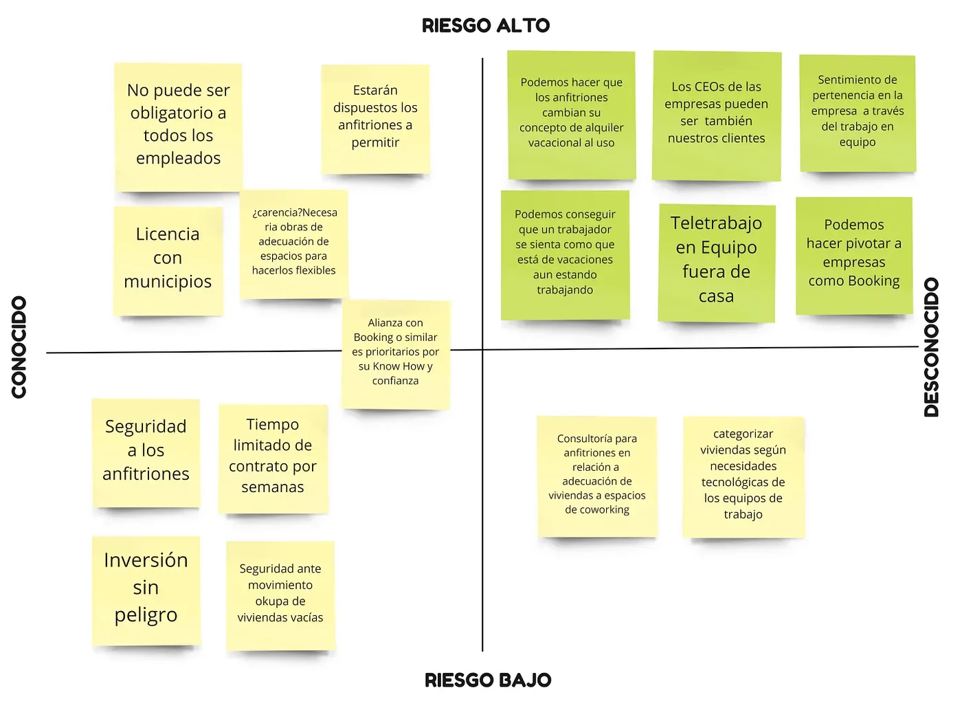
Hypotheses
Now it was time to turn those assumptions into hypotheses we could validate.
- We believe that with our product, hosts will find it attractive to change their traditional holiday rental model for a completely different and equally profitable one.
- We believe that with our product, employees will find their place in the company again, motivated by a kind of holiday while working as a team away from home and the office.
- We believe that with our product, company CEOs (always forgotten in the remote work debate) can find a tool that helps their employees perform again and stop resigning so often.
- We believe that with our product, both business owners and remote workers will get back the sense of belonging and team spirit lost since the lockdown.
- We believe that with our product, remote work, but as a team and away from home for short periods, can be the perfect escape valve to keep employees and employers motivated and excited.
- We believe that with our product, we can create value for companies like Booking, hit hard by the recent crisis, and help them pivot towards this new business model. Their know-how in the sector and proven reputation can build trust, so an alliance with them is a highly relevant strategy for the new MVP.
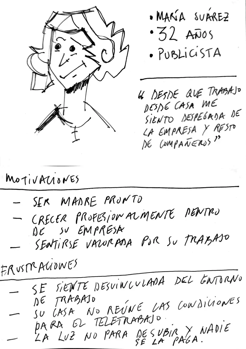
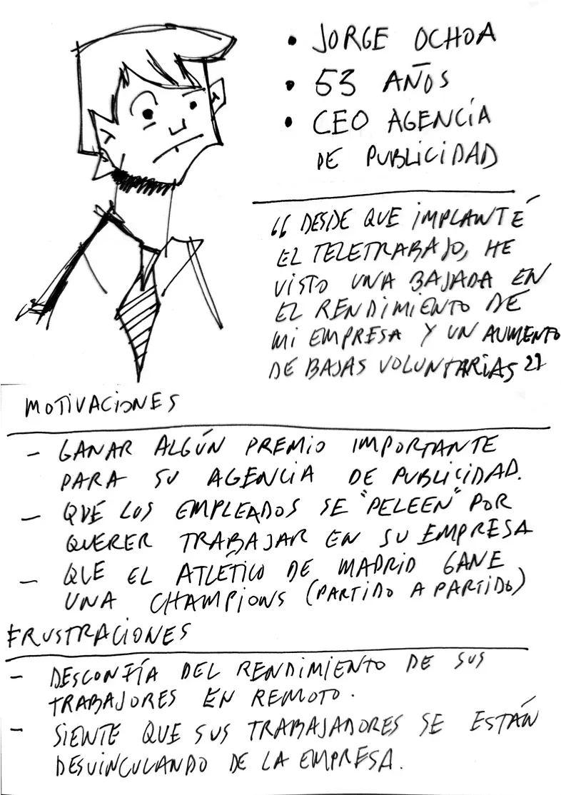
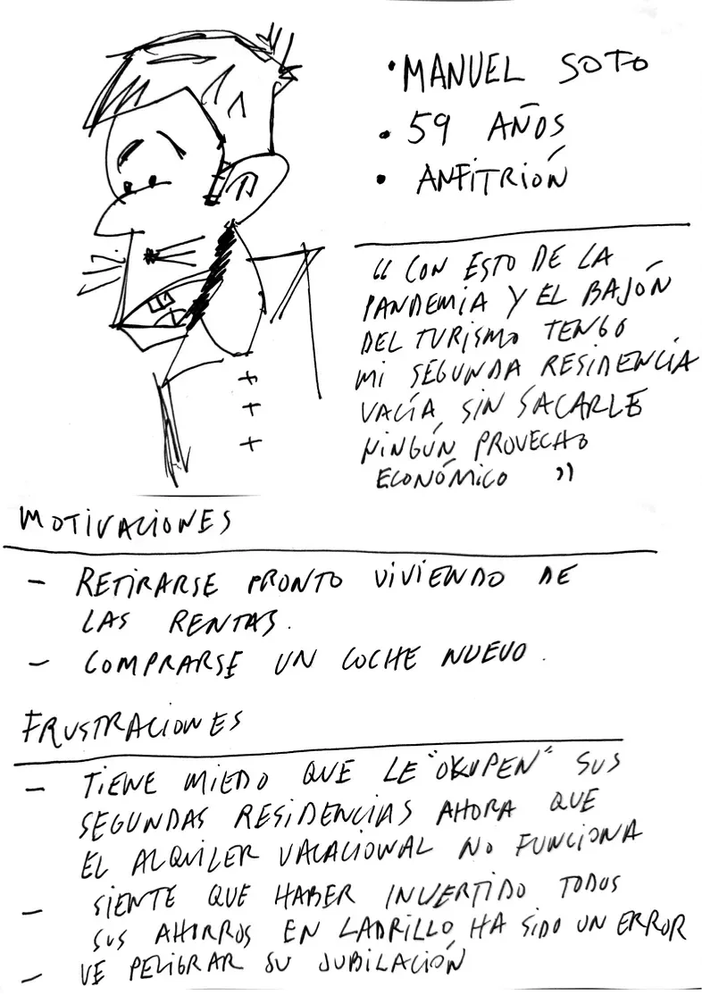
Proto-personas
In this case, the platform has 3 types of users. So we created 3 different proto-personas with their typical profiles:
Remote worker, CEO-business owner and host.
Lean UX canvas
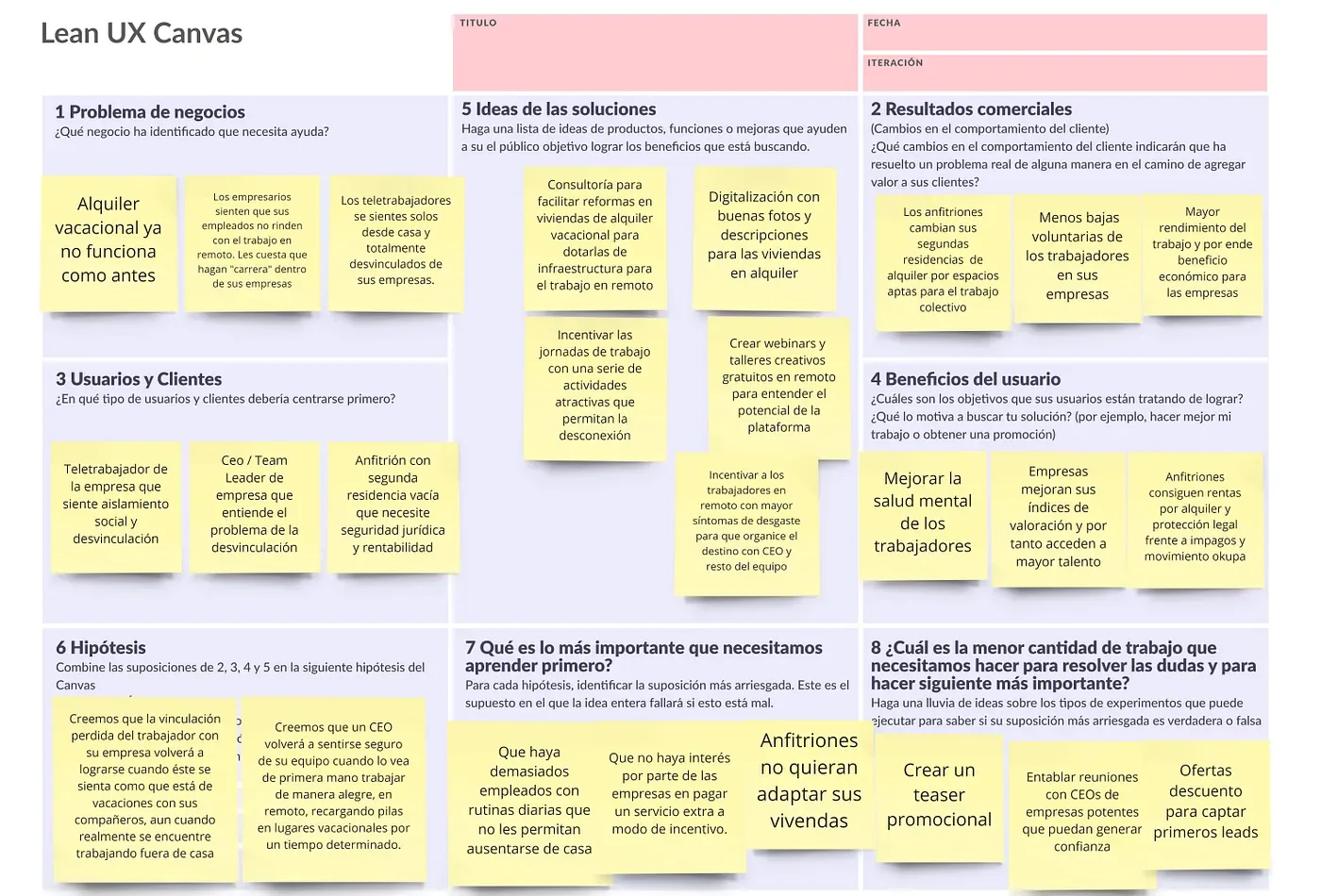
After empathizing with the proto-personas, we studied our business model in depth with a Lean UX canvas. This canvas puts the problem to solve at the center (instead of a solution to implement) and defines what we need to build, measure and learn.
From that moment on, the team was very clear about the problem to solve and how to build, measure and learn step by step.
Low-fidelity prototyping
Before prototyping our MVP (we chose a landing page), we wrote simple user stories directly related to our proto-personas. They helped us organize the future features and tasks of our product or service.
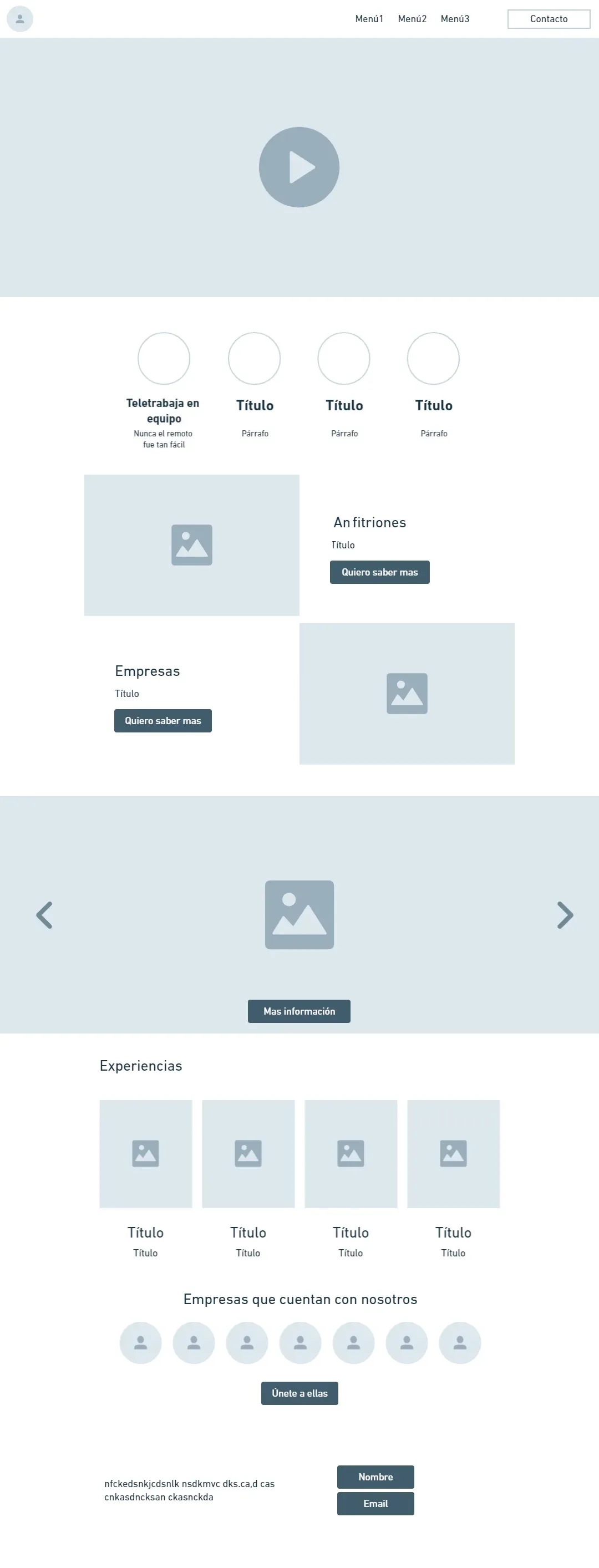
As a team, we started drawing low-fidelity wireframes of the general structure of the landing page. Then we moved them to Whimsical to lay them out digitally, still in low fidelity, but with a bit more rigor and consistency before the final high-fidelity design.
At the top there would be a navigation bar and a strong hero in the first section, with a video or image and careful UX writing. Below it, a band with icons explaining what the platform offers and who it is for.
In the next section we went for a Z-pattern layout, which we know works very well visually in these cases, with a photo and its own CTA for each band.
We also proposed a full-width photo carousel of resorts and available homes, plus another section with cards describing experiences that can also be booked.
To build trust with interested companies, we added a section with the logos of companies that had already used our services.
Last but not least, we added a contact form to capture leads and a footer to close this one-page design.
Visually, this is the structure I just described:
High-fidelity prototyping (Figma)
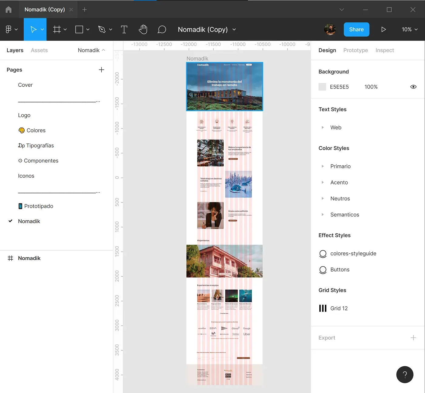
The high-fidelity prototype was built in Figma following the Bootstrap framework, with a 12-column grid of 65 px columns and 30 px gutters.
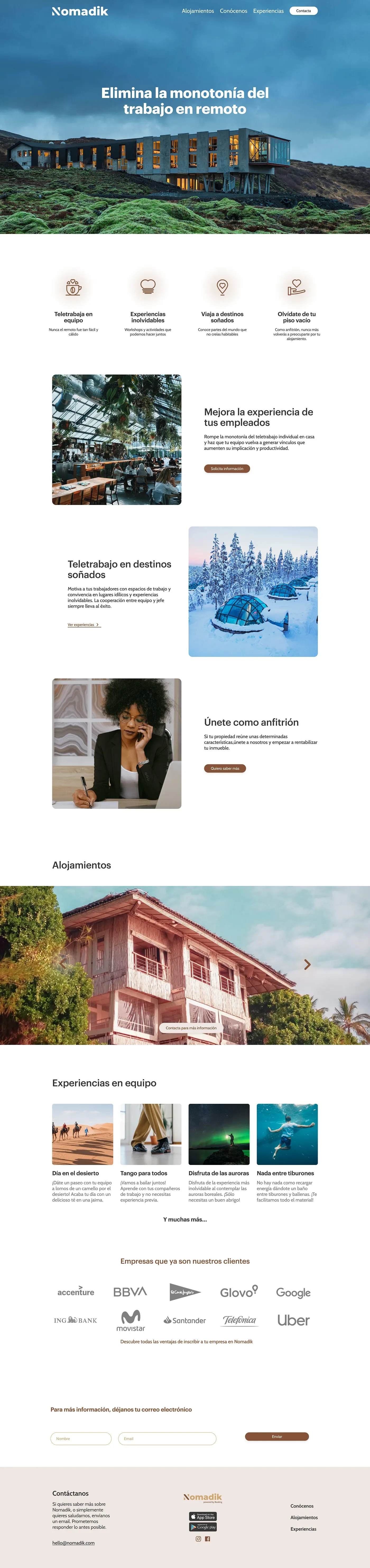
And this was the final result, where the hero video was replaced by a photo with a parallax effect.
Design system
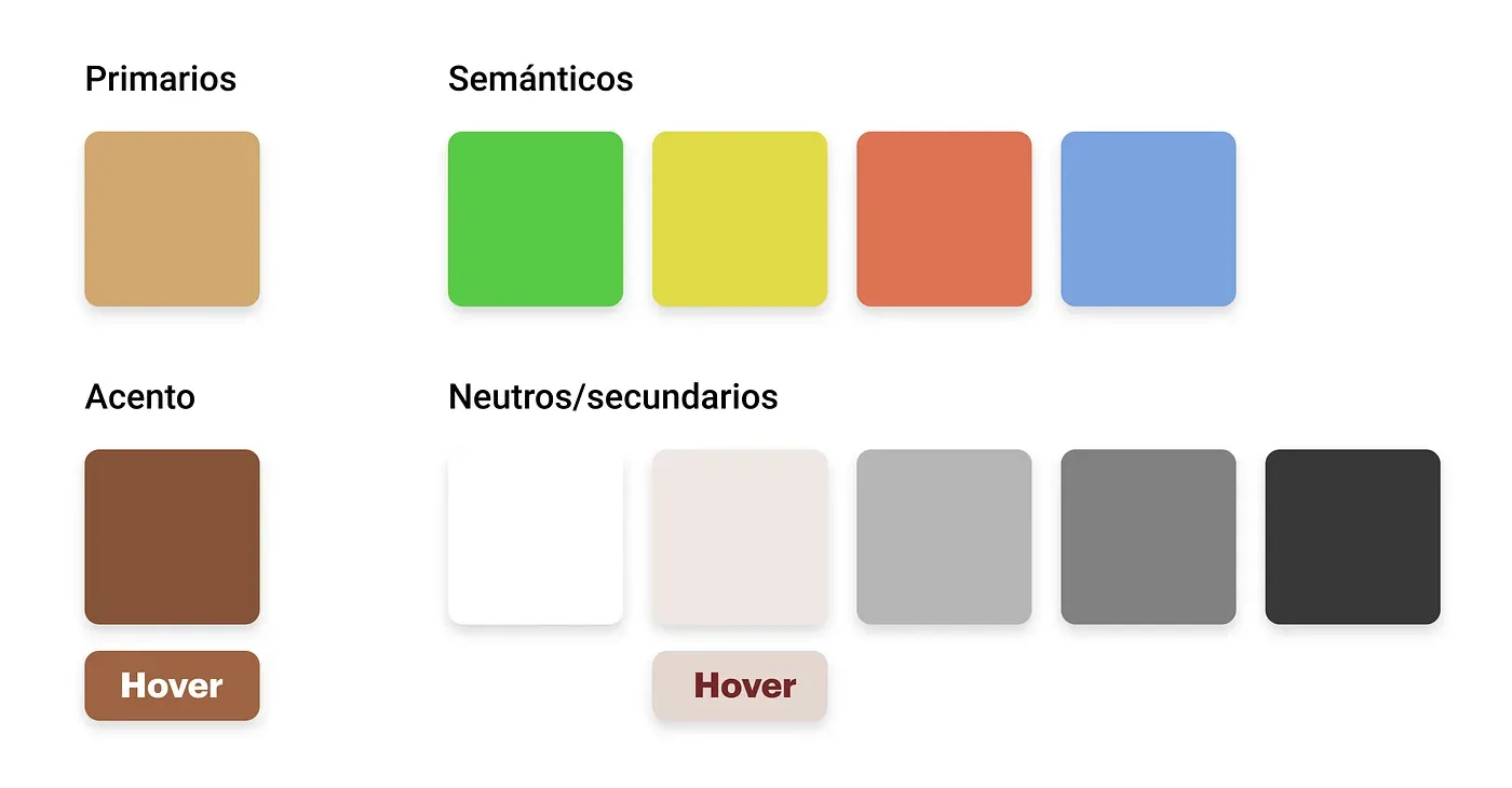
Colors
The color choice comes from the branding concept behind the brand: Nomadik.
For the logo and branding we used a play on words from nomad and the digital age we live in. Nomadic communities move from place to place instead of settling permanently in one location. That connection between nomads and their journeys through countless landscapes led us to choose “earthy” colors as primaries. The neutral secondary colors complement them perfectly, without clashing.
Typography
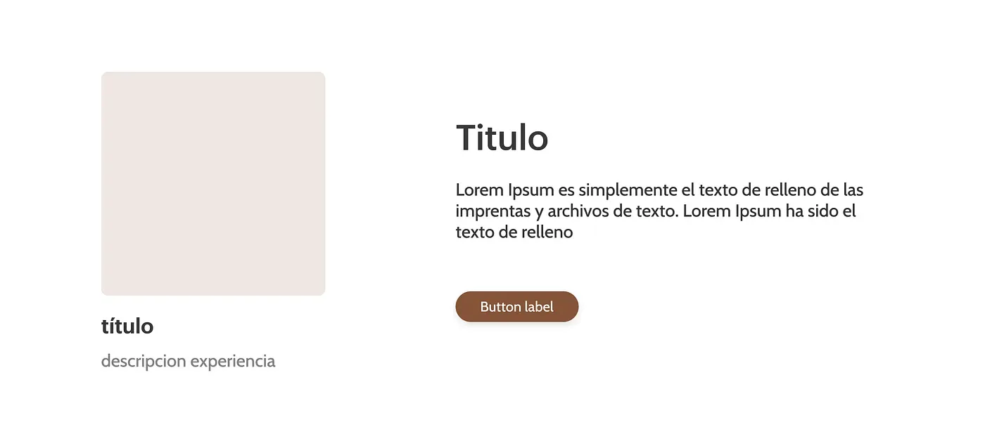
We chose two typefaces: Graphik for headings, in different weights and sizes, and Cabin for paragraph text.

Components
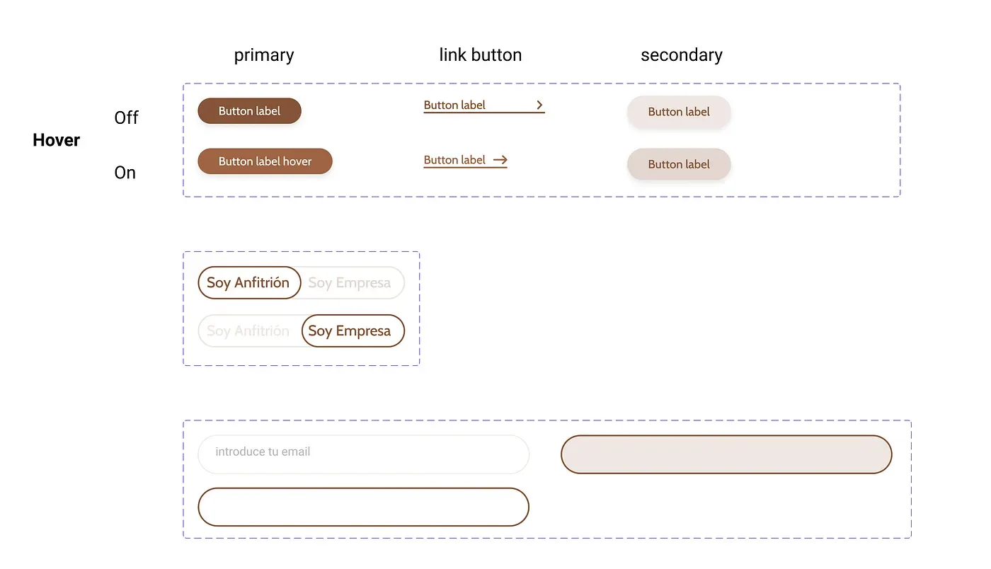
Turning elements into components in Figma made the team’s workflow much faster. We created components and variants for buttons, forms and some very simple cards.
Goals and KPIs
Finally, with the website ready but not yet published, we set a series of milestones to measure and analyze after launch.
We set several goals to measure with KPIs. A KPI, key performance indicator, is a metric that summarizes how effective and productive a business’s actions are, so you can make decisions. By analyzing them, we can see which actions worked best to reach a project’s goals.
After a few weeks, we decided it was time to find out if our product was interesting to users. And, more importantly for us as entrepreneurs, to understand if we had a good business model. It was time to analyze the metrics.
Since the website was built with WordPress from scratch, we used tools like Google Analytics, Hotjar, Mailchimp and social media.
We set 3 main goals we could measure to learn about the viability of the MVP:
- Generate awareness to test the potential of the service.
- Capture leads through a form on the website, as a loyalty strategy.
- Generate engagement with a visibility strategy on social networks like Slack, Twitter and LinkedIn, among others.
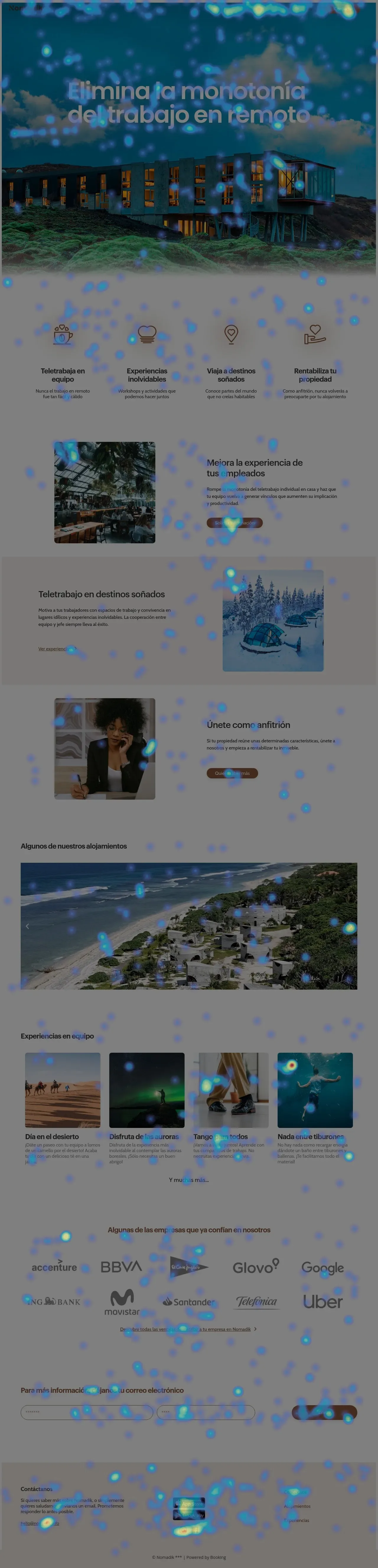
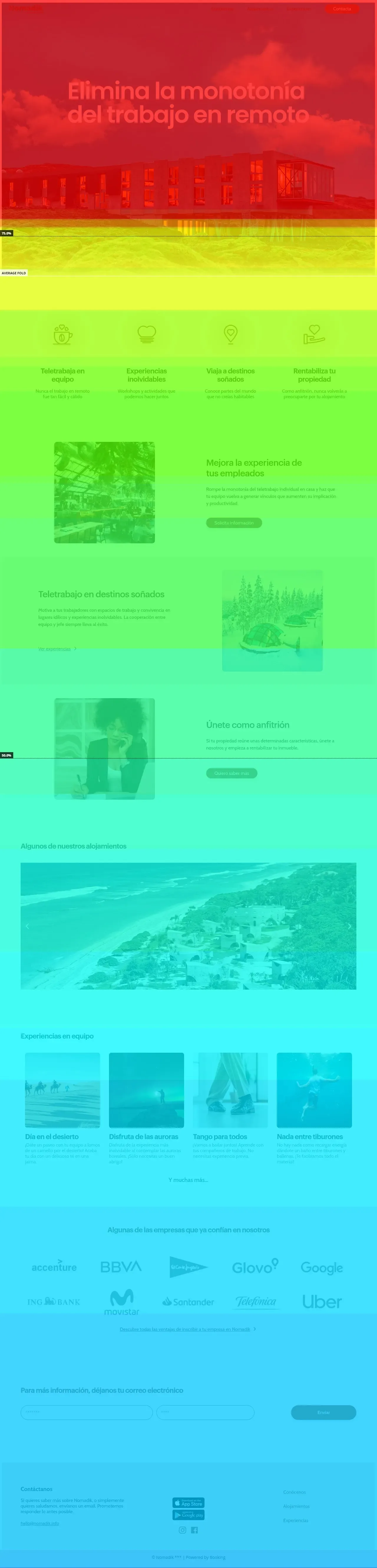
In Hotjar we got interesting heatmaps showing where visitors moved their cursor and clicked.
We also saw that no more than 40% of users scrolled to the bottom of the page.
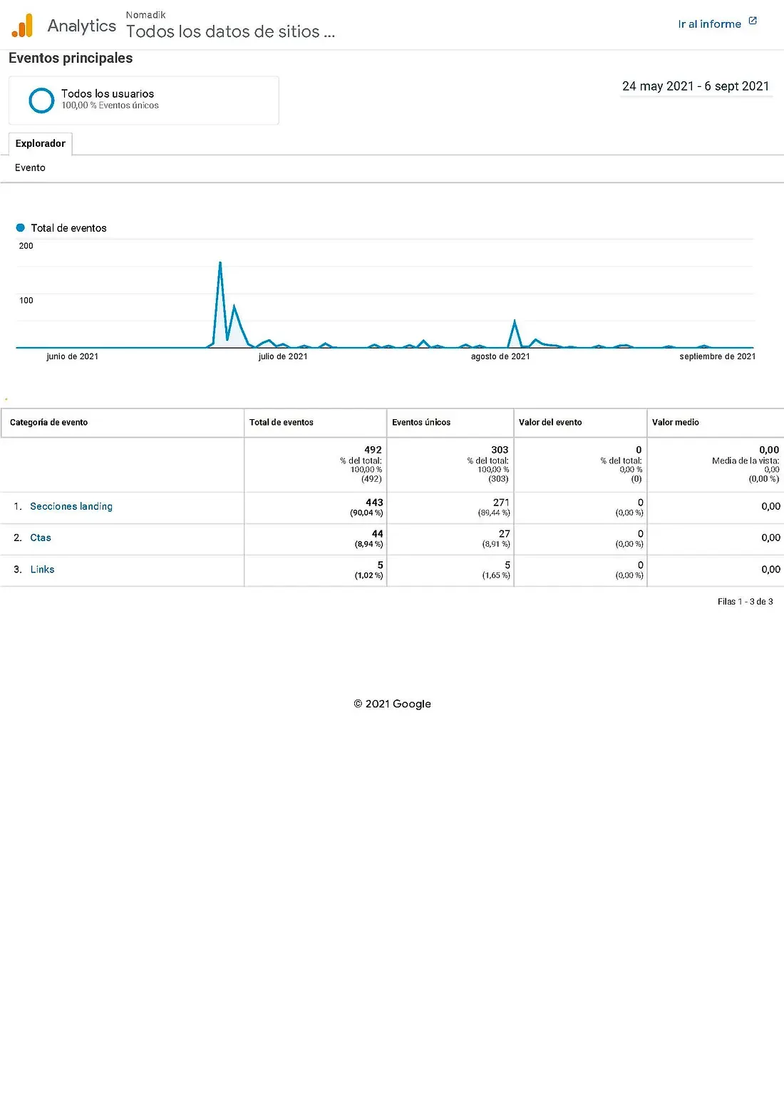
In Google Analytics we analyzed, among many others, the following metrics:
- 73 unique users visited the website. Goal: 100 users. Not reached.
- 38.28% bounce rate. Goal: below 60%. Reached.
- 271 scroll events to sections of the page. Goal: 250. Reached.
- 27 clicks on the different CTAs on the website. Goal: 75% of unique users, 55 clicks. Not reached.
- 5 users, who could be CEOs, looked for more information as a company through a specific link. Goal: get the attention of 10 companies with that link. Not reached.

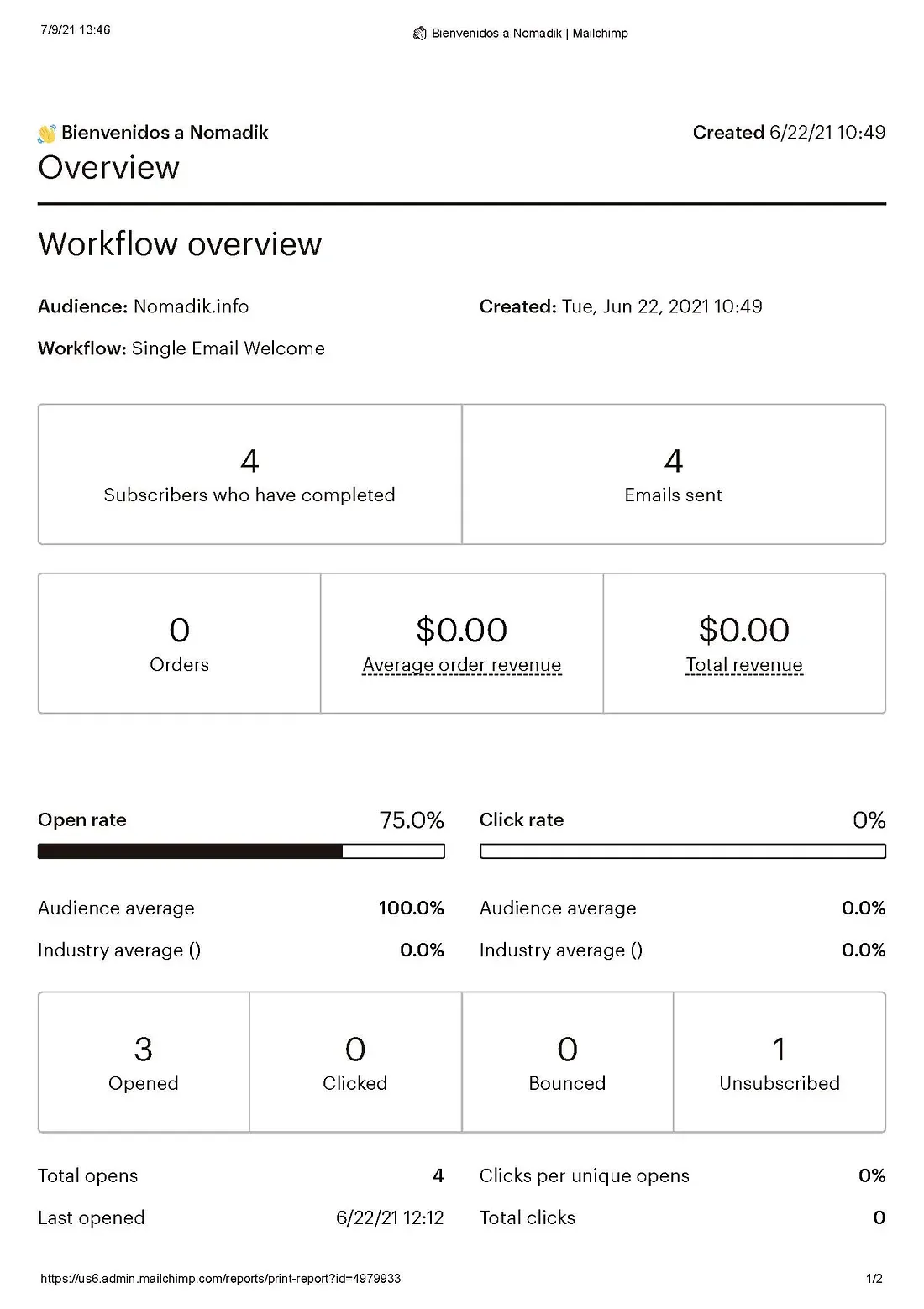
From the contact form we placed at the bottom of the page (where several of the most important CTAs pointed), we only got four sign-ups (leads), who received an automatic email from Mailchimp. Only 75% of these subscribers opened the campaign email we had designed, and one person also unsubscribed.
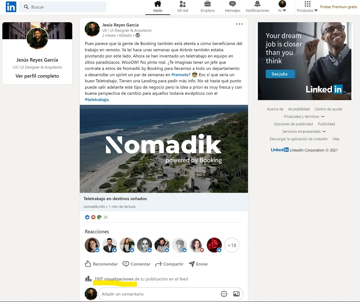
On social media, the idea got quite a lot of interest on LinkedIn: the teaser in my own post created a lot of activity, with about 26 interactions and 1,107 views to date.
Conclusions and next steps
Lean UX worked surprisingly well to build a product like Nomadik in record time (less than two weeks).
With this minimum viable product, we can confirm the leitmotif of this methodology: “fail fast, fail cheap”. With a project developed in such an agile way, with almost no research compared to Design Thinking, we were able to confirm that the idea and its business model sparked enough interest to keep developing them. I also think it’s a good moment to analyze whether we could pivot on some features. For that, we need to keep analyzing, making changes and studying new metrics. And that is exactly what we are doing now…
As a team we are very happy, even though we didn’t reach many of the KPIs we set as goals. We know that by promoting the website more on social media, adding a promotional video, iterating and running A/B tests, among other techniques, we could attract potential clients and users.
And if you made it this far, all that’s left is to thank you for reading to the end. Thank you!
And as the great Confucius would say:
“Choose a job you love, and you will never have to work a day in your life.”